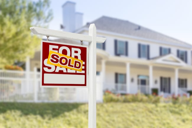
Drivers are notoriously distracted, and pedestrians are often hurried. This means your realtor sign has mere seconds to make an indelible mark, necessitating an intentional approach to its design and siting. Let’s explore three elements that make realtor signs sell themselves to potential property buyers:

- Color. The first thing someone notices about your sign is its color. In this case, consider going for bold, bright, and modern hues that grab attention from a distance and convey trustworthiness plus professionalism. A contrasting background to your primary text, too, can be crucial for readability. The goal is to make your sign pop, ensuring it’s not just seen, but instantly recognized and remembered among a sea of visual noise.
- Font. Your message needs to be absorbed quickly, and that means steering clear of ornate or overly complicated fonts that are difficult to read, especially from a moving vehicle. Instead, you should opt for clean fonts that offer excellent legibility. The text size is equally critical; it needs to be large enough to be understood in a fleeting moment. A well-chosen, clear font ensures your contact information and property details are easily digestible, prompting quick action from interested buyers.
- Placement. Realtor signs should be positioned for maximum visibility, ideally without any obstructions like trees, bushes, or other street furniture. Consider the angles of sight from both directions of traffic flow. Sometimes, angling your sign slightly or placing it further from the curb can dramatically increase its visibility, ensuring it captures attention from the broadest possible audience.
A great sign doesn’t just announce – it invites, entices, and sells before a word is spoken. At King Tutt Graphics, we know exactly what we can do to make your realtor signs work smarter for you. Let’s get your listings the spotlight they deserve – give us a call today.

")


